How to open an Attractive 3C Digital Store?
In the competitive 3C digital retail market, an attractive store boosts foot traffic, drives conversions, and improves customer retention. Below is a practical guide to building a 3C digital store, covering five key dimensions—overall design, internal layout, display racks, accessories, and checkout counters—to enhance your brand image and market competitiveness.

1.Overall Design Style: Align with Trends and Target Audience
3C digital products inherently embody a sense of technology and fashion, so the store’s design must match this attribute while integrating brand tone and target customer needs to create a distinctive memory point:
(1) Follow trendy color palettes: Prioritize colors that align with current aesthetics in the digital industry, such as tech-savvy deep space gray, futuristic silver white, or low-saturation Morandi tones. Avoid overly dull or exaggerated colors to ensure the overall visual effect is concise and modern.
(2) Incorporate brand’s main color: Integrate the brand’s core color into design details (e.g., display rack borders, wall decorations, lighting ambiance). For example, if the brand’s main color is blue, it can be used as an accent in the floor lines of the experience area or the borders of light boxes to form a unified visual system.
(3) Match target audience positioning: For high-income customers (e.g., buyers of premium smartphones or professional digital equipment), the design should emphasize grandeur and luxury, using marble floors, metallic decorations, and customized lighting systems. For middle-income customers (e.g., buyers of mid-range smartphones or digital accessories), simplicity and practicality are key—adopt eco-friendly boards and transparent layouts to reduce spatial oppression and enhance shopping comfort.
2.Internal Layout: Rational Planning Centered on “Convenient Experience”
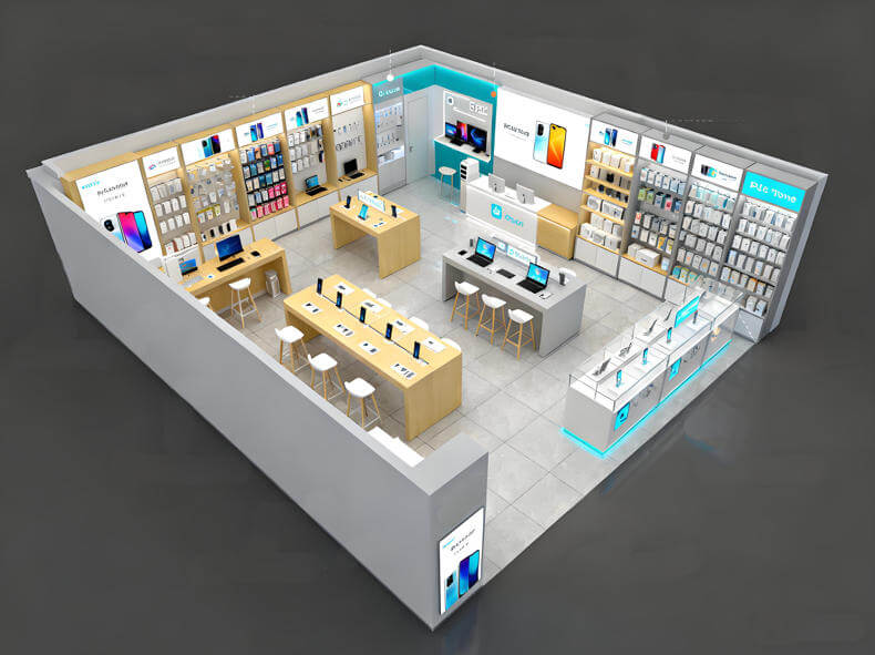
A well-organized internal layout is crucial for improving customers’ shopping efficiency and experience. It should be designed around three principles: clear product categorization, smooth experience flow, and comprehensive service functions:
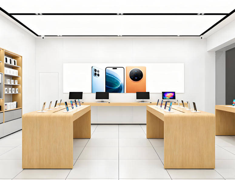
(1) Precise zoning by product type: Strictly follow the principle of “concentrated display of similar products.” Separate smartphones, tablets, and laptops into independent core areas to avoid cross-category clutter. At the same time, set up a dedicated area for accessories such as headphones, phone cases, chargers, and data cables—this area can be adjacent to the smartphone section (to facilitate cross-selling) or near the entrance (to encourage impulse purchases), ensuring customers can quickly find their target products.
(2) Set up an exclusive product experience area: Reserve an open experience area of at least 2-3 square meters in the core product sections (e.g., smartphones and tablets). Equip it with comfortable seats, fast-charging ports, and product guide manuals, allowing customers to freely operate and test product performance (e.g., screen display, sound quality, running speed). “Immersive experience” helps stimulate purchase intent.
(3) Plan an after-sales service area: Allocate a corner or a non-core traffic area (e.g., near the exit) for after-sales service. Equip it with professional repair tools, testing equipment, and waiting seats, and clearly label signs for “after-sales consultation” and “device repair.” This not only makes it convenient for existing customers to resolve issues but also enhances brand trust through professional services.
III. Display Rack Design: Balance Display Effect, Experience Convenience, and Security
Display racks are the “visual carriers” of 3C digital products. They should highlight product advantages while ensuring experience convenience and product security:
(1) Gondola Display Rack Design
- Experience Area Gondolas: Adopt a combination of “solid wood countertops + metal table legs.” The warm texture of solid wood softens the coldness of digital products, while the open, integrated design allows customers to freely pick up and compare different models of smartphones and tablets. Use brushed metal for the table legs to enhance a premium feel. To prevent product theft, install invisible anti-theft cables (connected to the bottom of products, with a length of 30cm or less to avoid affecting operation) in hidden positions on the countertop.
- Non-Experience Area Gondolas: Use a structure of “solid wood base cabinets + transparent glass covers.” The base cabinets can store backup inventory, while the glass covers effectively prevent dust without blocking product visibility. Embed LED light boxes on the front of the cabinets to loop brand promotional videos or new product feature introductions (e.g., smartphone operating systems, camera capabilities), attracting customer attention through dynamic visuals.
(2) Wall-Mounted Display Rack Design
- Core Product Display: Combine “solid wood backboards + glass shelves.” The solid wood backboards provide stable support and a high-end texture, while the thin, transparent glass shelves clearly showcase the appearance details of smartphones and tablets. Control the spacing between shelves to 30-40cm to avoid blocking products on upper and lower layers, and install sufficient lighting (LED light strips under each glass shelf, with soft, non-glaring light).
- Accessory Display Optimization: For small accessories like headphones and phone cases, use a combination of “iron pegboards + adjustable hooks.” Pegboards allow flexible adjustment of hook positions based on accessory sizes, maximizing wall space utilization while making all accessories visible and easy for customers to select. Choose matte black hooks to maintain visual consistency with the pegboards and avoid a cluttered look.
- Top Brand Promotion: Install long LED light boxes on top of wall-mounted display racks, printed with the brand logo or core slogans (e.g., “Technology Empowers Life,” “Premium Digital Choices”). Set the brightness of the light boxes higher than the store’s basic lighting to strengthen brand visual memory.
(3) Accessory Application: Enhance Product Texture and Customer Experience Through Details
Thoughtful accessory matching not only highlights product advantages but also improves the store’s overall quality and reduces customers’ decision-making costs:
- Exclusive Display Stands for New Products: For newly launched products such as smartphones and tablets, customize high-end display stands made of acrylic (transparent or translucent). Set the stands 10-15cm higher than regular display positions and pair them with exclusive “NEW” labels (e.g., metallic “NEW” badges) to attract customers’ attention at first glance.
- Product Information Boxes: Place acrylic product information boxes on the countertops of the experience area. Organize product manuals, specification sheets, and after-sales policy booklets in categories inside the boxes, with clear product models printed on the covers. This allows customers to easily access detailed information about product functions and services.
- Upgraded Accessory Hooks: Use “iron + electroplating” hooks (e.g., chrome-plated or nickel-plated) for hanging headphones and phone cases. The hooks have a smooth, burr-free surface and only cost 10%-15% more than ordinary hooks. However, they significantly enhance the sophistication of accessory displays, allowing customers to perceive “detailed quality.”

(3) Checkout Counter Design: Create a Lasting Brand Impression
The checkout counter is the end of the customer’s shopping journey and a key touchpoint for brand image communication. It should balance practicality and personalization:
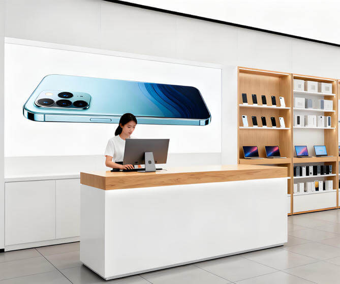
- Material and Style Positioning: Adopt a combination of “black painted solid wood body + white artificial stone countertop.” The black solid wood body exudes calmness and grandeur, while the white artificial stone countertop (scratch-resistant, wear-resistant, and easy to clean, suitable for daily stains) creates a classic black-and-white color scheme that conveys a premium texture. Control the countertop width to 60-80cm to reserve sufficient space for cash registers, receipt printers, and customer shopping bags.
- Brand Logo Enhancement: Embed the brand logo in the center of the checkout counter’s front panel. The logo uses a “stainless steel casting + acrylic core” process, with LED lights (matching the brand’s main color) installed on the back. When powered on, the logo emits a three-dimensional glowing effect, ensuring customers clearly perceive the brand image even during checkout.
- Functional Detail Optimization: Add a small storage shelf on the side of the checkout counter (for customers to place temporary items) and reserve charging ports at the bottom (for customers to charge devices while waiting). Meanwhile, post clear payment method signs (e.g., WeChat Pay, Alipay, and credit card icons) to improve checkout efficiency and reduce customer waiting time.